印际首发 x 品界设计 | 田 · 当代美术馆


抽象的力量形成了秩序。

The power of abstraction forms order.

从古典式样中析出的“古典法则”进化到现代主义处于支配地位的当下,隐秘的、内在的和构成一定磁场吸引力的同时能够被我们所感知的内在秩序一直存在,它就像一颗有着顽强生命力的“种子”,可以从中萌发出关于建筑、结构、材料、空间形态的“抽象几何性”概念,也进而发展出一种基于场所的切实可行的建造方法。

The“classical principles”extracted from the classical style has evolved to the present when modernity is in a leading position. However, the hidden, inner order that forms a magnetic attraction has always existed and perceived by us. It is like a“seed”with tenacious vitality, from which sprouting the concept of“abstract geometry”about architecture, structure, material, and spatial form. And then to develop a specific construction method based on certain site.


幽而隐谧

Concealed And Still

对于BOSMIA 波西米亚来说,位于长沙湘江西岸的滨江店是一次全新的身份展示,以18000㎡的体量建构了品牌旗下首个文化艺术综合体。密斯·凡·德·罗曾认为“结构是像逻辑一样的东西”,缜密、清晰、有迹可循,这种论述也同样适用于具体的建筑形态,远观之下,纵横排布的线性建筑外立面于高楼林立的都市之中呈现出独特的表皮肌理。

For BOSMIA, the Binjiang store located on the west bank of the Xiangjiang River in Changsha, is a brand-new identity display, constructing the brand's first cultural and artistic complex with a volume of 18,000 square meters. Mies van der Rohe believed that “structure is like logic”, which is meticulous, clear, and traceable. This point of view is also applicable to specific architectural forms. Seen from a distance, the criss-cross linear facades of the building presenting a unique skin texture in the city.
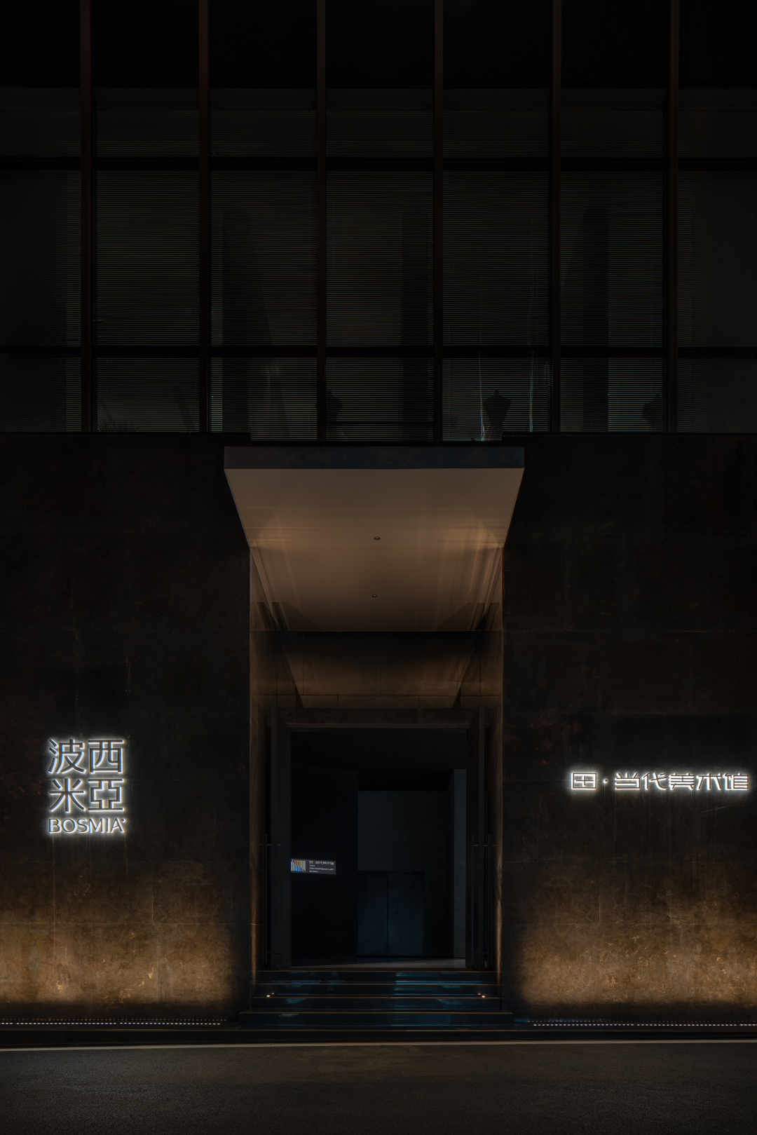


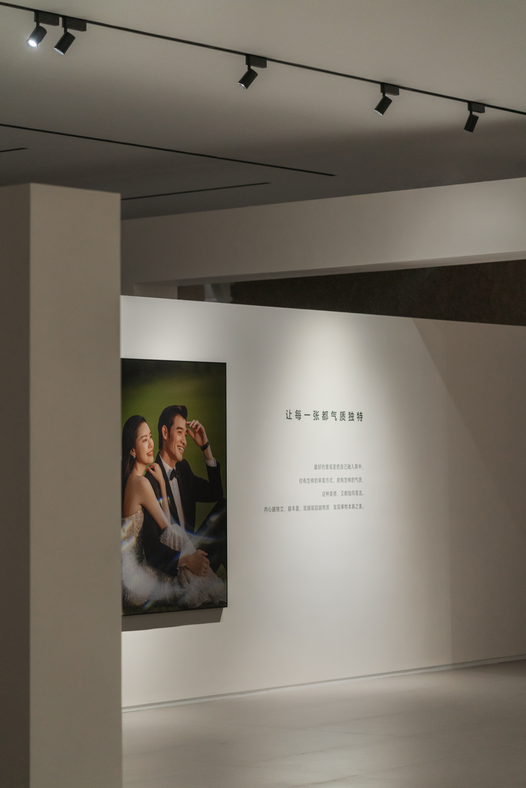
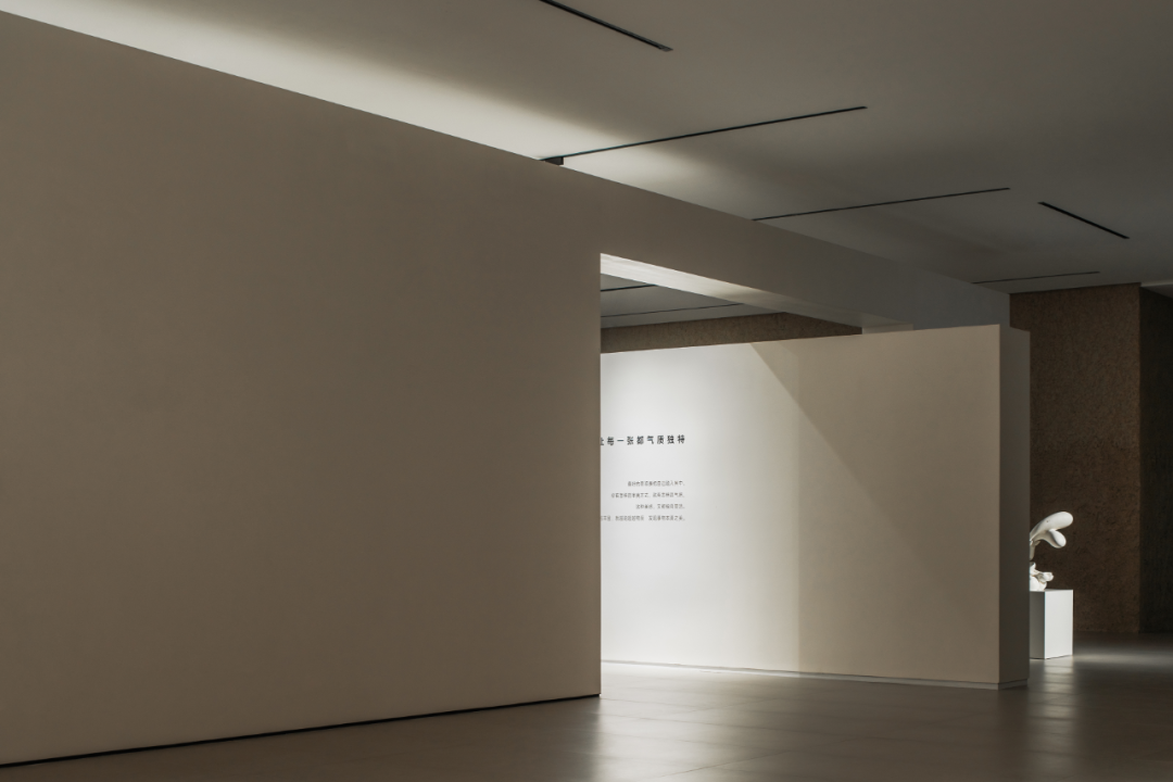
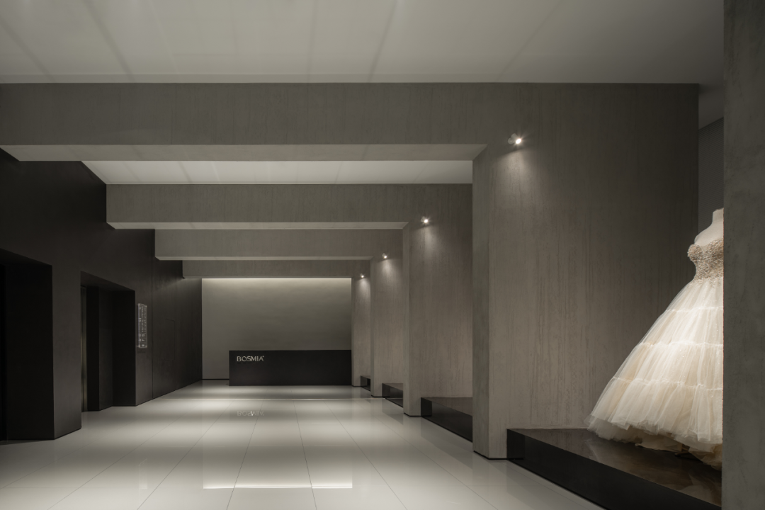
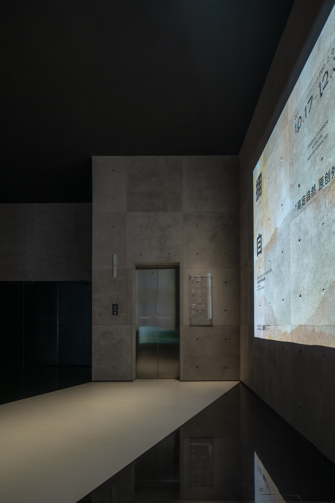
作为品牌的独立入口,结合门头以及形象展示的围合建构了“序厅”的基本特征,以含蓄、纯粹、美术馆式的氛围营造迎接每一位顾客的到访。拾级而上,室外的人潮涌动、街道的喧闹和明亮光线的动态情境瞬间转变为静止的、幽谧的空间状态。为了解决垂直电梯布局的失衡,一道斜墙由平面生长而出,打破常规意义上中心轴线的圭臬,建立非对称的平衡感。

As the independent entrance of the brand, the combination of the door and the image display constitutes the basic characteristics of the enclosed “preface hall”. Creating a subtle, pure, and art museum style atmosphere to welcome customer's visit. Stepping up the stairs, the dynamic situation of outdoor crowds, noisy streets and bright light instantly transforms into a static and concealed space status. In order to solve the imbalance of the vertical elevator layout, a slanted wall grows out of the ground,breaking the standard of the central axis and establishing an asymmetrical balance.

个体记忆

The Individual Memory

相对于多维的空间,时间则表现为不可逆的线性特质。虽然成长后的我们走出了乡地,但是那些不曾忘却的乡土记忆却一种萦绕在每位游子的心头。于是,在空间之中,泥土演变为抽象记忆的具象载体。通过垂直电梯到达三楼,代表着记忆的“泥土盒子”与流动的“泥土立面”蔓延于不同的场域,隐约地再现了随着时间消逝而日渐深刻的个体记忆。

Unlike space, which has multiple dimensions, time is irreversible and unidirectional. Although we have grown up and left the homeland, those memories of home have never been forgotten,lingering on everyone's mind. So, the soil evolves into a concrete carrier of abstract memories in the space. Take the elevator to the third floor, the“soil box” and “soil facade” showing in different space, vaguely reappearing the individual memory which has become more and more profound as time goes by.
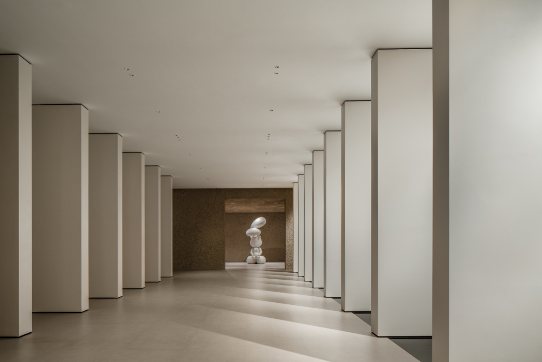

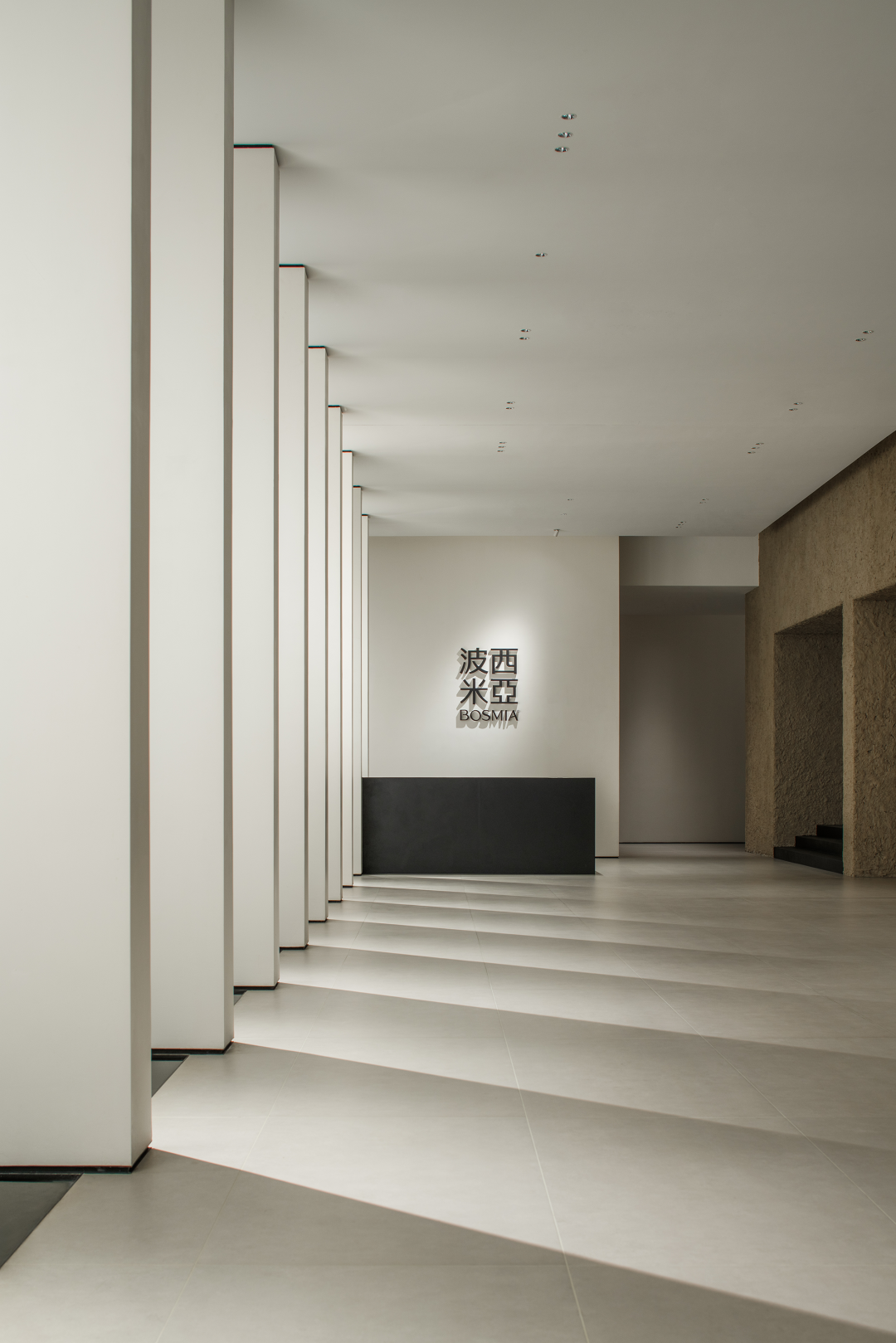
若使墙壁展现活力并成为空间体量的构成部分,则需要重新发现纯粹表面所具有的审美价值。竖立于主动线两侧,匀质排布的片墙建立了“序列”的仪式语言,光穿过幕墙投射于地面,为简练的地面增添活泼的、灵动的自然光影。借助形态的精准表达,使前台区成为了浓重的迎宾区域,也成为室内拍摄的最佳背景。

In order to make the walls come to life and become part of the space volume, it is necessary to rediscover the aesthetic value of the pure surface. The walls are arranged evenly on both sides of the main traffic flow, establish a ritual language of “sequence”. Light passes through the curtain wall and projects on the ground, adding vivid natural light and shadow to the simple ground. The reception area becomes a impressive welcome area by the precise construction of the form, also as the most popular background for indoor shooting.
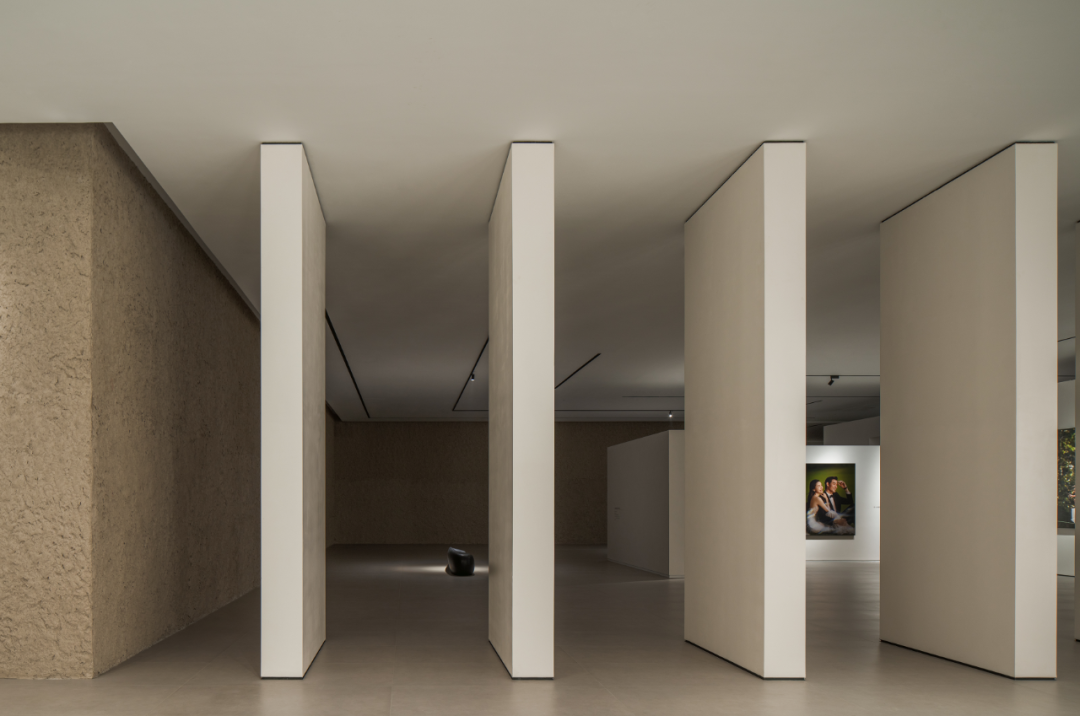
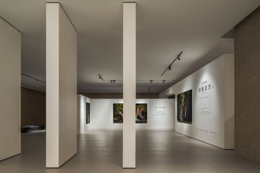
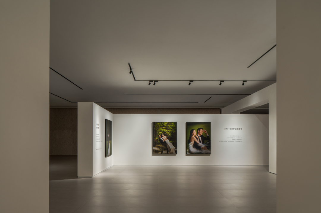
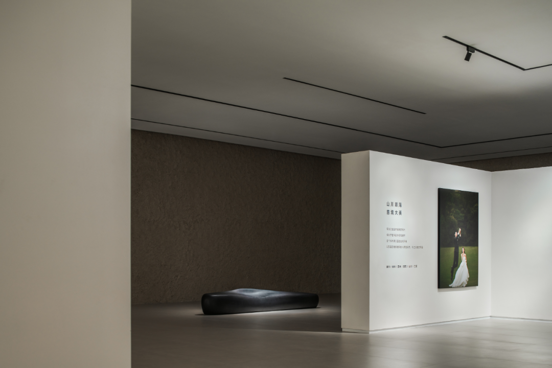
关于艺术与观者的转换关系一直是美学理论家们探索的重点,凝固的、动态的或者即时的艺术形式因为人的参与而产生更加丰富的意味。以一定面积的“浪费”所界定的开放式视觉沉浸区域为艺术的互动和表达提供了另一种新的可能,不定期更换的主题活动,使单一的空间具备了画廊、美术馆等多功能的灵活性和展示性。

The conversion relationship between artworks and viewers has always been the focus of exploration by aesthetic theorists. Solidified, dynamic or instant art forms will have richer meanings due to people's participation.The opening visual immersion area seems to “waste”some space, but it provides another new possibility for the interaction and expression of art. Different theme activities change from time to time, which makes the single space flexible and has multiple functions such as galleries and art exhibitions.
有机秩序

Organic Order
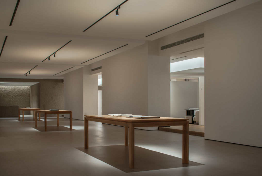
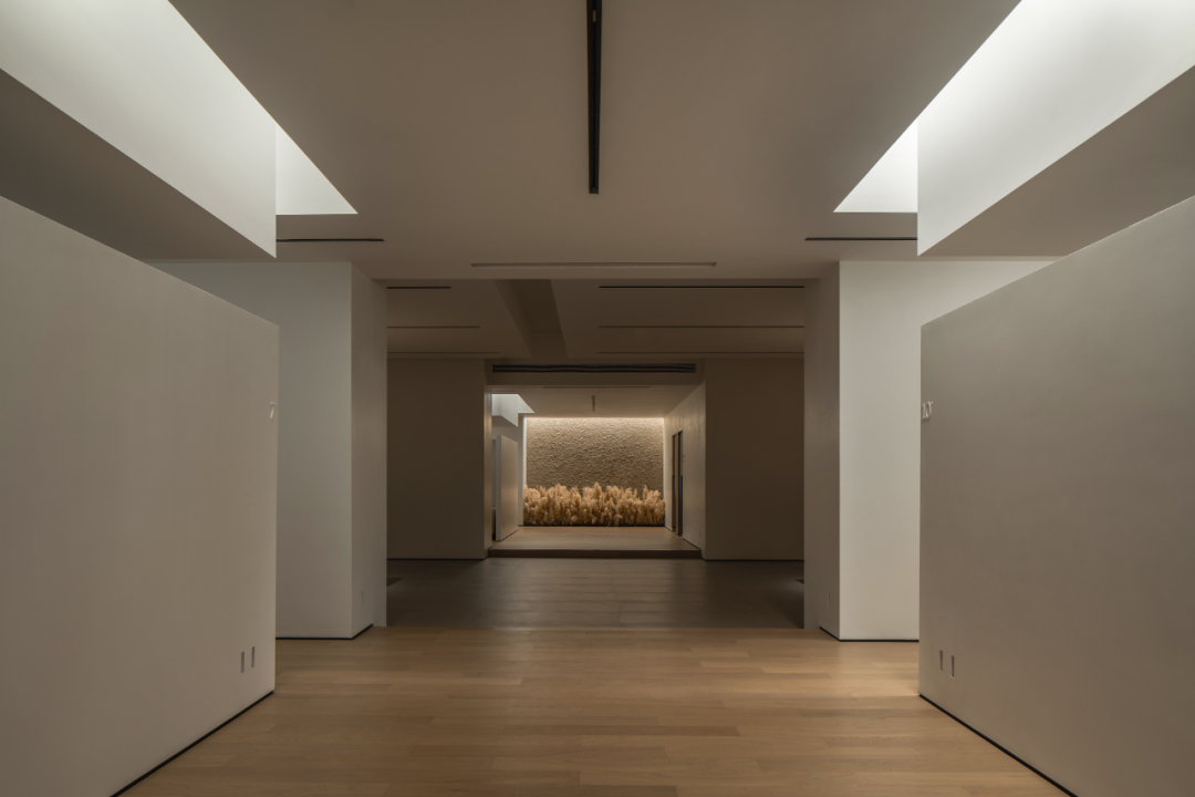
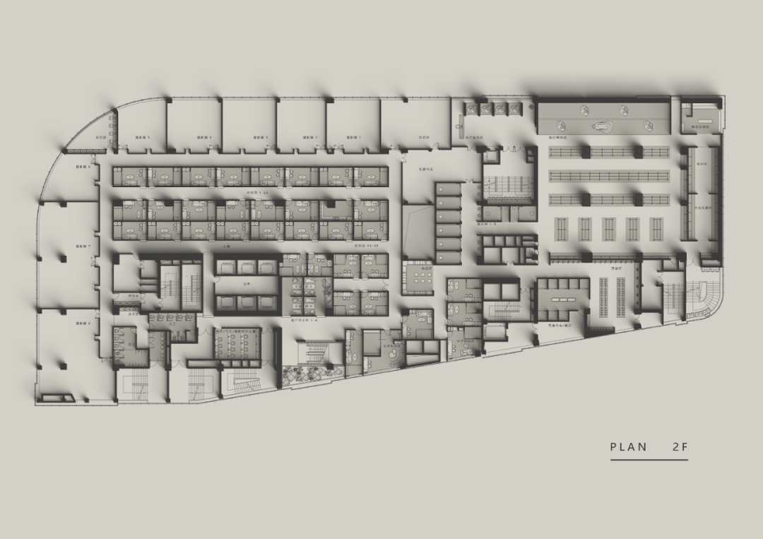
及至内里,空间的节奏由无序走向有序,同时对称的轴线也逐渐变得清晰起来。借助框架结构内的柱网为依据,让立柱隐藏于墙体,构成稳定的实体立面,而墙与墙之间,则开口以向。简洁、素雅、凝练的三张实木展台成为了空间的视觉焦点,除了作为日常装裱工作的台面之用,也可陈设画册,向顾客展示动人的影像时刻。

Step to the inside, the rhythm of the space changes from asymmetrical to ordered, and the central axis gradually emerges. Based on the column network in the frame structure, the columns are hidden in the wall to form a stable and solid facade. And the open walls correspond to each other. Three simple, elegant and concise solid wood booths become the visual focus of the space. In addition to being used as countertops for daily mounting work, they can also be used to display albums and show vivid image moments to customers.


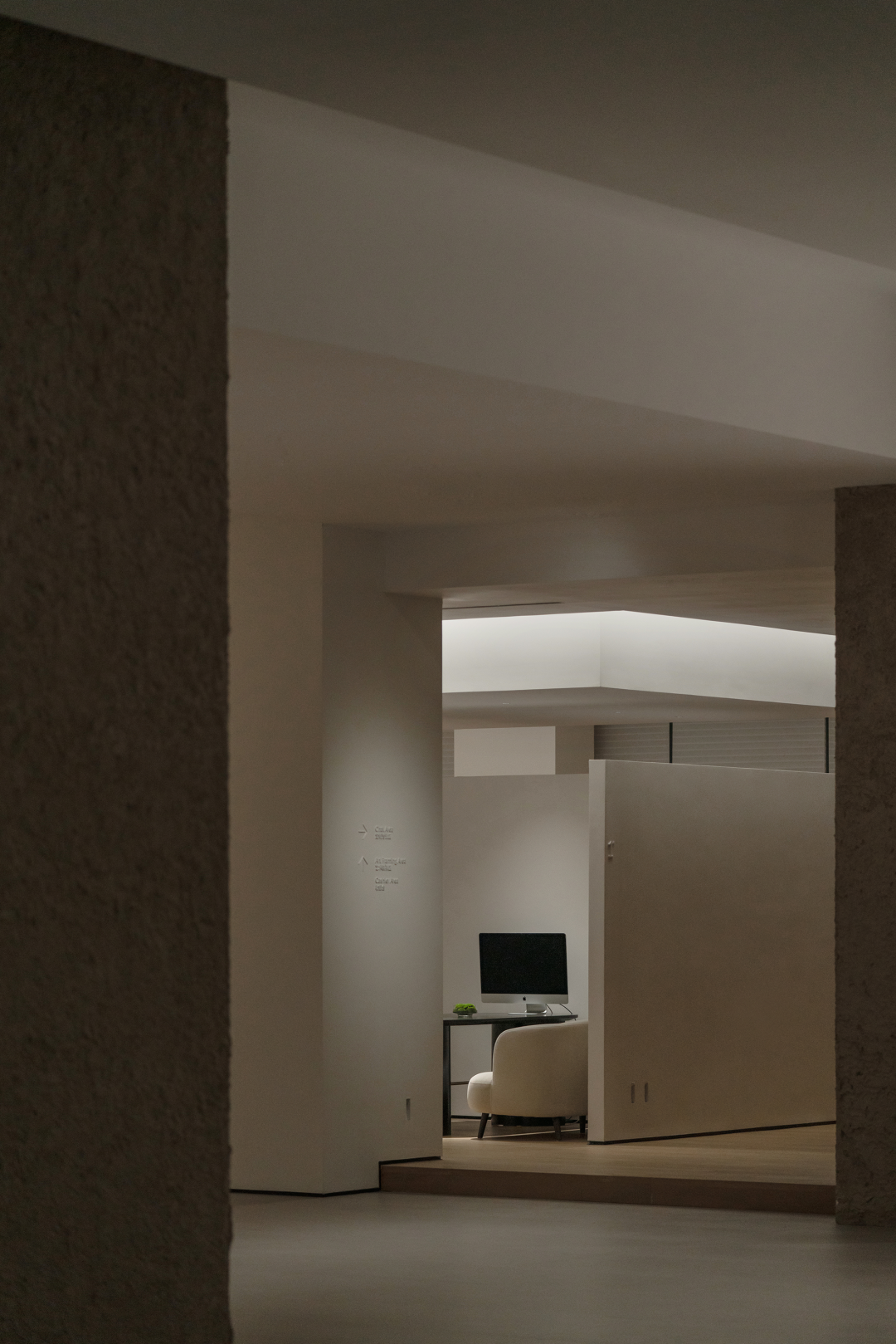
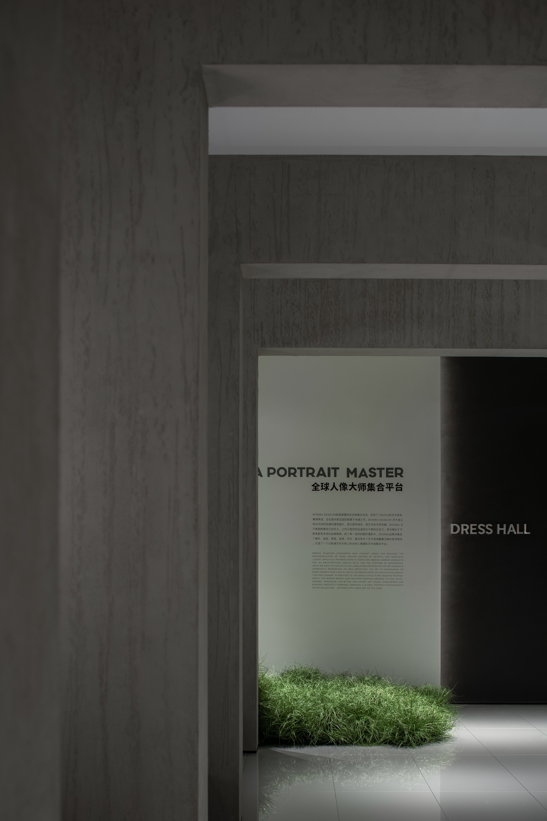
而构造、形体一致的选片区和接待区通过围合的方式打造了独立的自我属地,有利于单独的沟通、交流和签约。对应墙体的立面开口,高低错落的、彼此簇拥的芦苇荡出现在视觉的中心,这种专门的经营,形成了美妙的对景。在灯光的渲染下,随着远离城市的田园生活和旧日情结的浮现,从而与访客产生情感上的共鸣。

Enclosed selection area and reception area with the same structure and shape construct an independent territory, which is convenient to private communication and contract signing. Corresponding to the open walls, Reeds swarming with each other high and low appearing in the vision. This special Installation creates a beautiful opposite scenery. With the rendering of lights, as the pastoral life far away from the city and the old memory emerge, visitors will have an emotional resonance in it.


人生秀场
The Show Of Life
在北岛的短诗集中,一首名叫“生活”的诗作特别的引人注目,正文一字“网”,简洁有力的概括了生活的要义。家庭是复杂社会关系的最小单元,所以,婚姻对于大多数人而言,是“有情人终成眷属”的选择使然。自此,一个人与另一个人开始相处在一起,共同编织这张幸福而庞大的“生活之网”。

Bei Dao once wrote a special poem called “Life”. There is only one word——“web”, which summarizes the essence of life concisely and powerfully. Family is the smallest unit of complex society. So for most people, marriage is the inevitable choice for their romantic relationship. Since then, the two person began to live together, weaving this happy and huge “ web of life”.


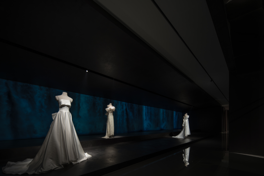
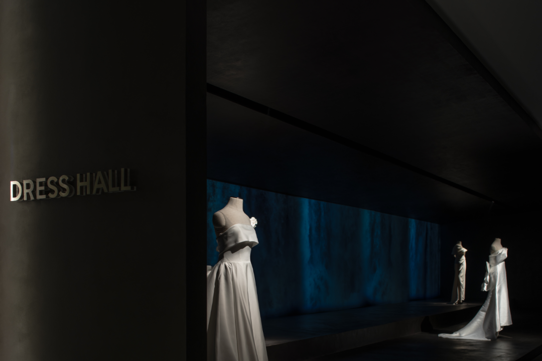
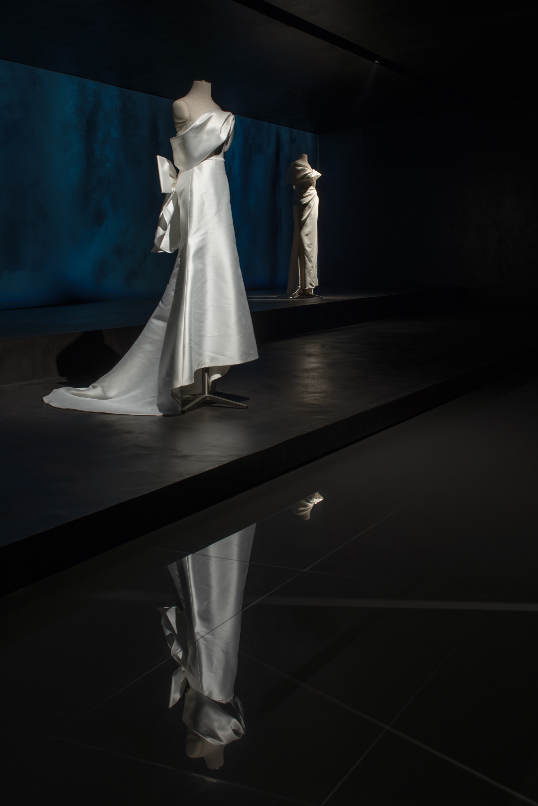
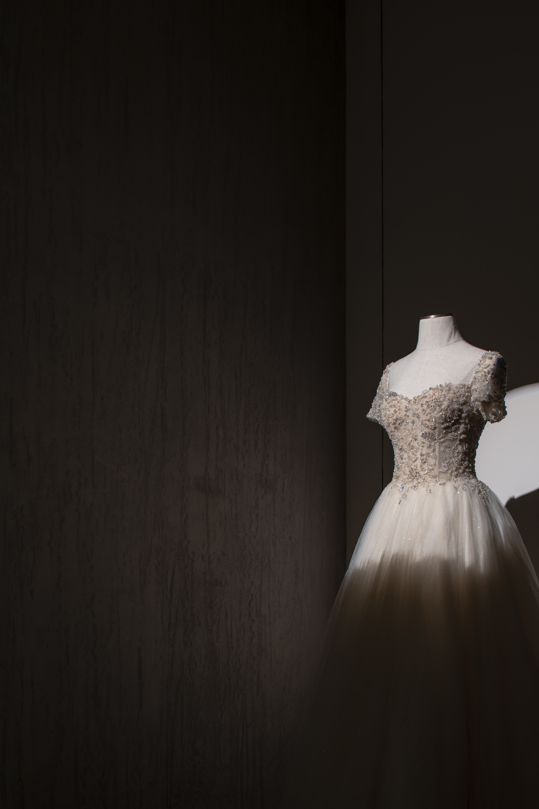
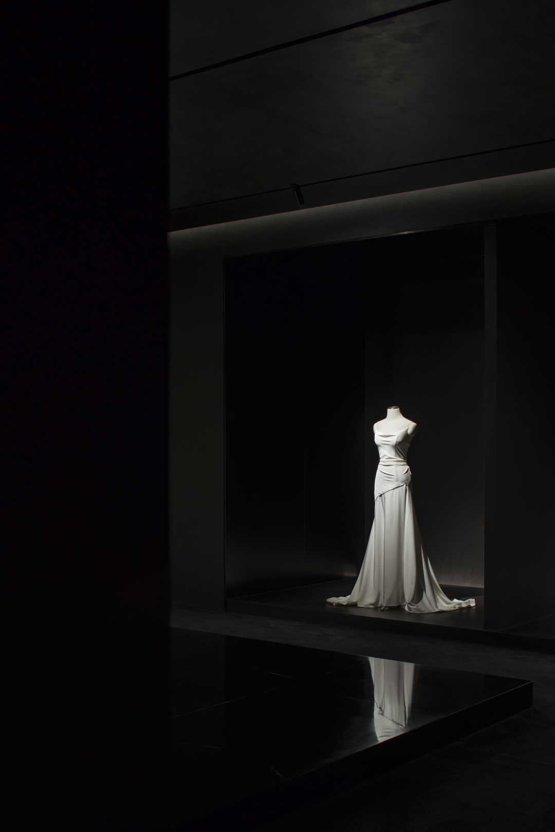
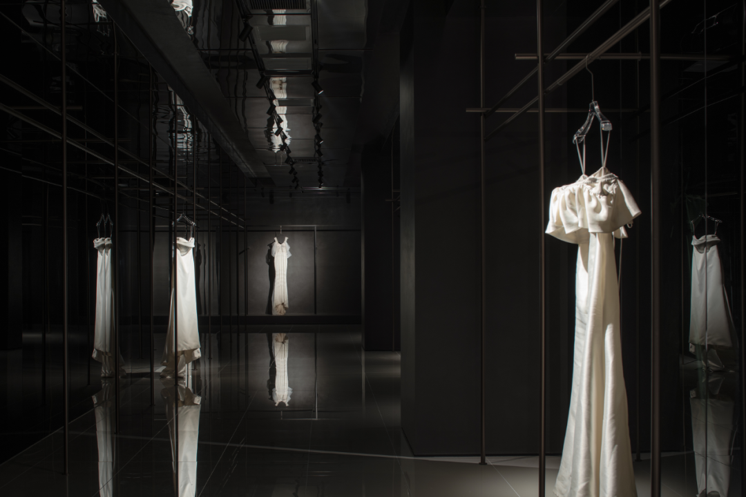
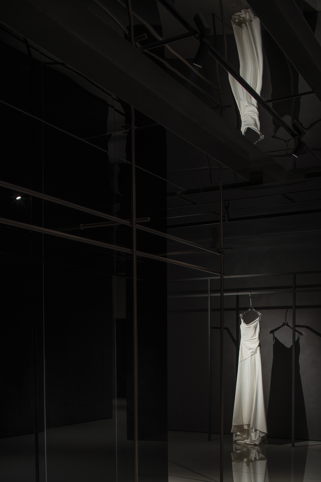
于是,“网”的社会意义一旦转变为设计师擅长的空间语言,那么呈现的物质形态则是另一番模样。与一般礼服的独立展架不同,无论重叠的支架还是天花的镜像、反射,二楼礼服区表现了一种交织性和连续感,昏暗的环境之中,在灯光的投射下,“网”的文化内涵被解构,礼服构成重要的展示焦点。

Therefore, once the social meaning of“web”was translated into the spatial language used by designers, the material form would present a very unique look. Different from the independent display racks of ordinary from, the dress area on the second floor shows a sense of interweaving and continuity through the overlapping brackets and the mirroring ceiling. In the dim environment, with the projection of lights, the cultural connotation of“web”is deconstructed, and the dress becomes the important display focus.
空间的存在意义因品牌精神而发生改变,先锋意识总是能够自主的激发访客的积极探索。涉及婚纱、造型、西装、装裱、手作、展览等多重艺术领域的BOSMIA 波西米亚一直以来尝试通过独特的方式传递“艺术无界”的哲学母题,并希望借此打造一个以影像艺术为核心的全球人像摄影艺术家集合平台。

The meaning of space changes by the spirit of brand. Pioneering consciousness can always inspire the autonomous exploration of visitors. BOSMIA, which involves multiple art fields such as wedding dresses, styling, suits, mountings, handcrafts, and exhibitions, has always been trying to convey the philosophical theme of “art without boundaries”in a unique way, and hopes to create a global portrait photography artist platform focus on video art.


项目信息
Information
项目名称:田·当代美术馆

Project Name:TIAN Contemporary Art Museum

设计机构:品界设计

Design Agency: Scope Design

主创设计:梁剑峰、翁德

Interior Design: Liang jianfeng、Wengde

项目地点:湖南长沙

Project Location:Hunan, Changsha

施工单位:荣锦建设

Construction:Rongjin Construction

设计面积:18000㎡

Project Area:18000㎡

设计时间:2021年7月

Design Time: 2021.7

竣工时间:2022年6月

Completion Time:2022.6

主要用材:浅色水磨石砖、浅灰色水泥地砖、墨玉大理石、土黄粗糙面微水泥、灰色微水泥、浅蛋壳色微水泥、橡木多层实木地板

Main materials: Light-colored terrazzo bricks、Light gray cement floor tiles、Black jade marble、Khaki rough surface micro-cement、Gray micro-cement、Light eggshell color micro-cement、Oak multi-layer solid wood floor

摄影:形在空间摄影/贺川
Photography:Here Space Photography / He chua
文字:无远文字/太白

Words:Off-words / Venus


梁剑峰翁德

品界设计 / 品牌创始人、设计总监

-
品界设计,由翁德与梁剑峰共同成立于福建漳州。自2014年始创以来,以敏锐的直觉和洞察力,坚持做诚实的设计,从项目前期到最终落地,整个过程都值得细心的品味,并通过专注、积极践行,不断地尝试探索设计的边界。业务主要涵盖室内设计、家居陈设、建筑外观和环境规划等,目前团队作品已获得国内外众多奖项和殊荣。

内容策划 / Presented
策划 Producer :W.Yinji
     排版 Editor:Lu JY     校对 Proof:Xran   
图片版权 Copyright :品界设计
©独家首发,转载请联系我们,翻版必究!


© 版权声明
THE END
喜欢就支持一下吧
点赞9 分享
评论 抢沙发
头像
欢迎您留下宝贵的见解!
提交
头像

昵称

取消
昵称表情代码图片

    暂无评论内容