
Gulyaev+Tsakharias is an interior architecture and design studio based in Russia, founded by Roman Gulyaev and Maria Tsakharias. The studio, which is made up of young people working in retail and commercial design, is inspired by local culture, natural materials and shapes we see in our daily lives.


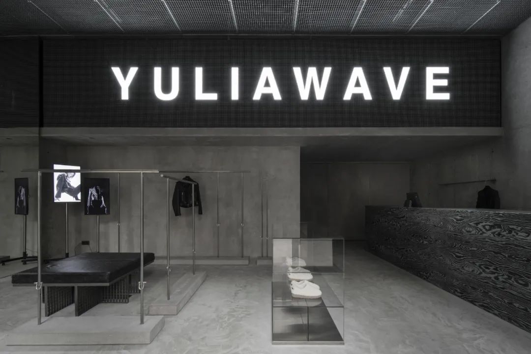
The Yuliawave store occupies 106 square meters on the ground floor of a monumental 1930s residential building. Gulyaev+Tsakharias was commissioned by owner Vasilevskaya to create an interior space that perfectly exemplifies the spirit of the brand. Inspired by the exposed concrete walls of the building, they envisioned a space dominated by natural, monochromatic materials that are the signature style basis for the Yuliawave flagship store.

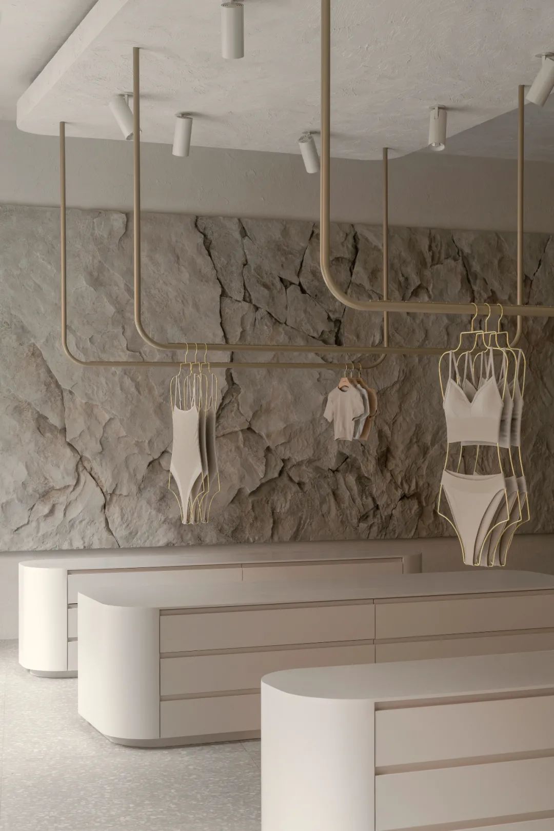


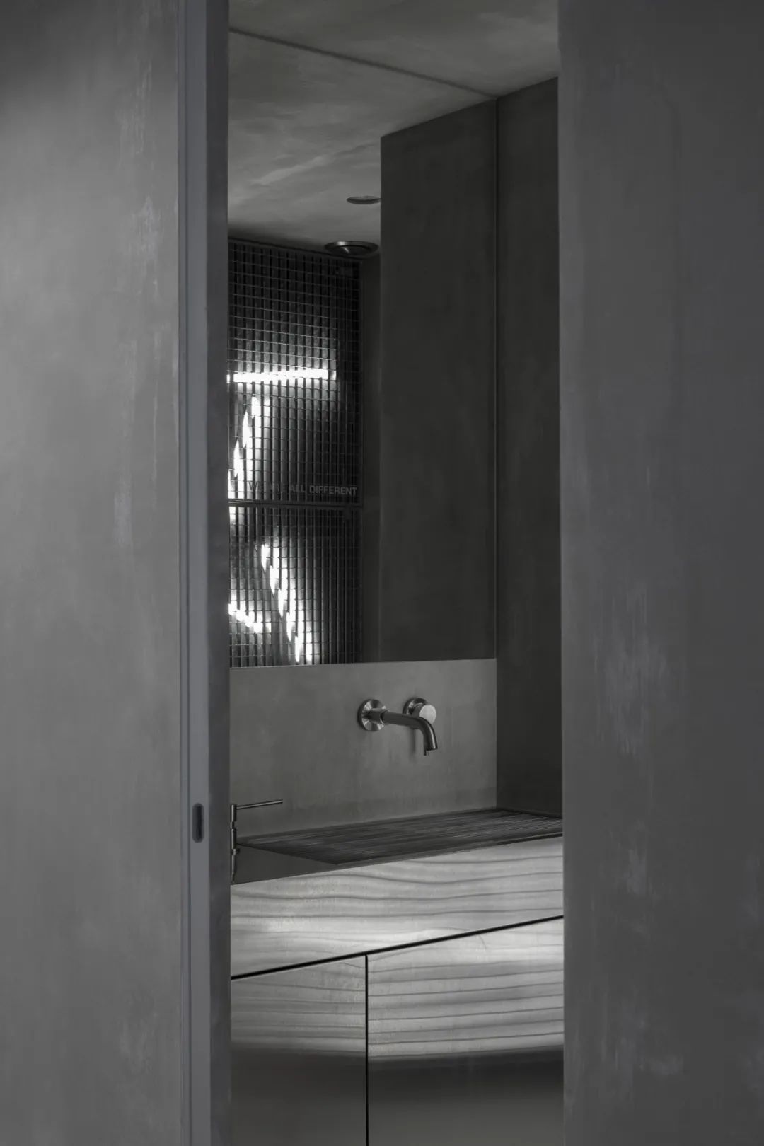
The concrete wall was one of the inspirations for Roman Gulyaev and Maria Tsakharias, who cleaned the paint covering its surface in order to show the aesthetic structure of the concrete and the original building. A large sales counter at the entrance leads visitors to the interior of the space, while a small hallway houses a small office and toilet. The back hall of Yuliawave is illuminated by three large Windows.


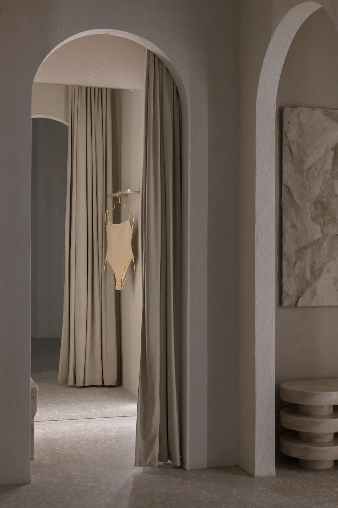
The design of the Lavarice flagship store was selected based on the properties, tone and texture of natural materials, so light beige became the dominant color of the space to further highlight the display of the goods inside. While the original walls were retained, the new layout and solution were elegantly incorporated into the new design language without disrupting the site environment or the ergonomics of the commercial space as much as possible.


The random variation of the walls, due to their plasticity and the multi-layered ceiling structure, allows Roman Gulyaev and Maria Tsakharias to introduce dynamic situations into the space, making the curvilinear wall from the entrance to the fitting room area the main moving line that guides the client through the exhibition hall. Some decorative elements in the interior not only define the characteristics of the space, but also become important components from another dimension.







暂无评论内容