自然万物抽象之后,无不被数学几何所概括。即便一株普通的植物,它的躯干、枝条、叶片以及叶脉的生长及组合的规律呈现出更多样、更巧妙的真实样貌,那么,是否有可能存在着某种数学的联系介入了自然的事物中呢?这种设想令勒·柯布西耶着迷,促使他真正的进入了一项“关于比例尺度研究的内容与精神”的领域。
After abstraction, everything in nature is invariably generalized by mathematical geometry. Even if an ordinary plant, its trunk, branches, leaves and veins grow and combine in a more varied and ingenious way, is it possible that there is some mathematical connection that intervenes in natural things? This idea fascinated Le Corbusier and led him to enter the realm of "the content and spirit of the study of proportional scales".
假若一个人身高1.75m,举起手臂来将近2.2m高,这样等同于两个叠放的1.1m的正方形,试着把第三个正方形嵌入其中,以“直角轨迹”的方式进行试验,通过反复推演,得到1.75-2.614-1.082的数值和一个递增的黄金分割数列,这个类似于斐波那契数列的现象,使理性的、“枯燥乏味”的数字借助数学几何的关联赋予了一个人性的尺度。
Suppose a person is 1.75m tall and raises his arms to nearly 2.2m high, which is equivalent to two stacked 1.1m squares, try to embed the third square in it and test it in the way of "right-angle trajectory". This phenomenon, similar to the Fibonacci sequence, gives a human scale to the rational and "boring" numbers through the association of mathematical geometry.


优雅的比例
Elegant Proportions
━
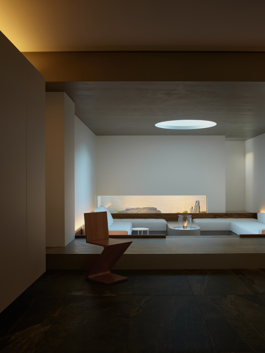
1947年,勒·柯布西耶将研究的成果称为“模度”并以著书立说的形式,令这种具有自然科学属性的审美观念与内涵公之于众。而2.16m作为黄金分割里的基准线,出现在泰美工意美学馆里,界定了地台高度和梁位底面。也使水平横向的视觉感受在狭长的长方形空间里,构成了立面连续的流动性和别具心思的优雅风景。
In 1947, Le Corbusier called the result of his research "Modulus" and made this aesthetic concept and connotation, which has the properties of natural science, public in the form of a book. As the baseline of the golden section, 2.16m appears in the Tamiya Aesthetic Museum, defining the height of the floor and the bottom of the beam. It also makes the horizontal and horizontal visual sensation in the narrow rectangular space, constituting the continuous fluidity of the façade and an elegant landscape with a special idea.

张永和曾设计了一款名为“厚薄折”的屏风,其厚度从一端的4mm过渡到另一端的40mm,光线穿过时,屏风的透明度出现自然性的渐变,产生清晰又模糊的视觉效果。这里“厚与薄”的概念也是“清晰又模糊”的,在厚薄之间有无限数值的最优解,这些尺度或者说比例关系,激活了不同的物理形态和象征意义。
Zhang Yonghe has designed a screen called "thick and thin", whose thickness transitions from 4mm at one end to 40mm at the other end, and when light passes through, the transparency of the screen appears a natural gradation, producing a clear and blurred visual effect. Here the concept of "thick and thin" is also "clear and blurred", and there are infinite values of optimal solutions between thick and thin, and these scales or proportional relationships activate different physical forms and symbolic meanings.


力学的审美
The Aesthetics of Mechanics
━
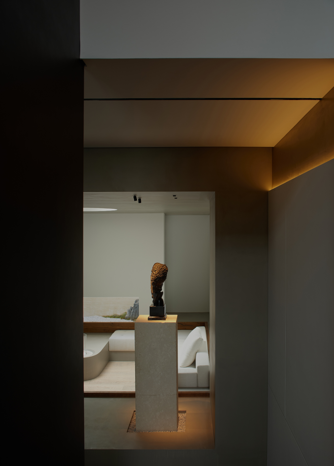
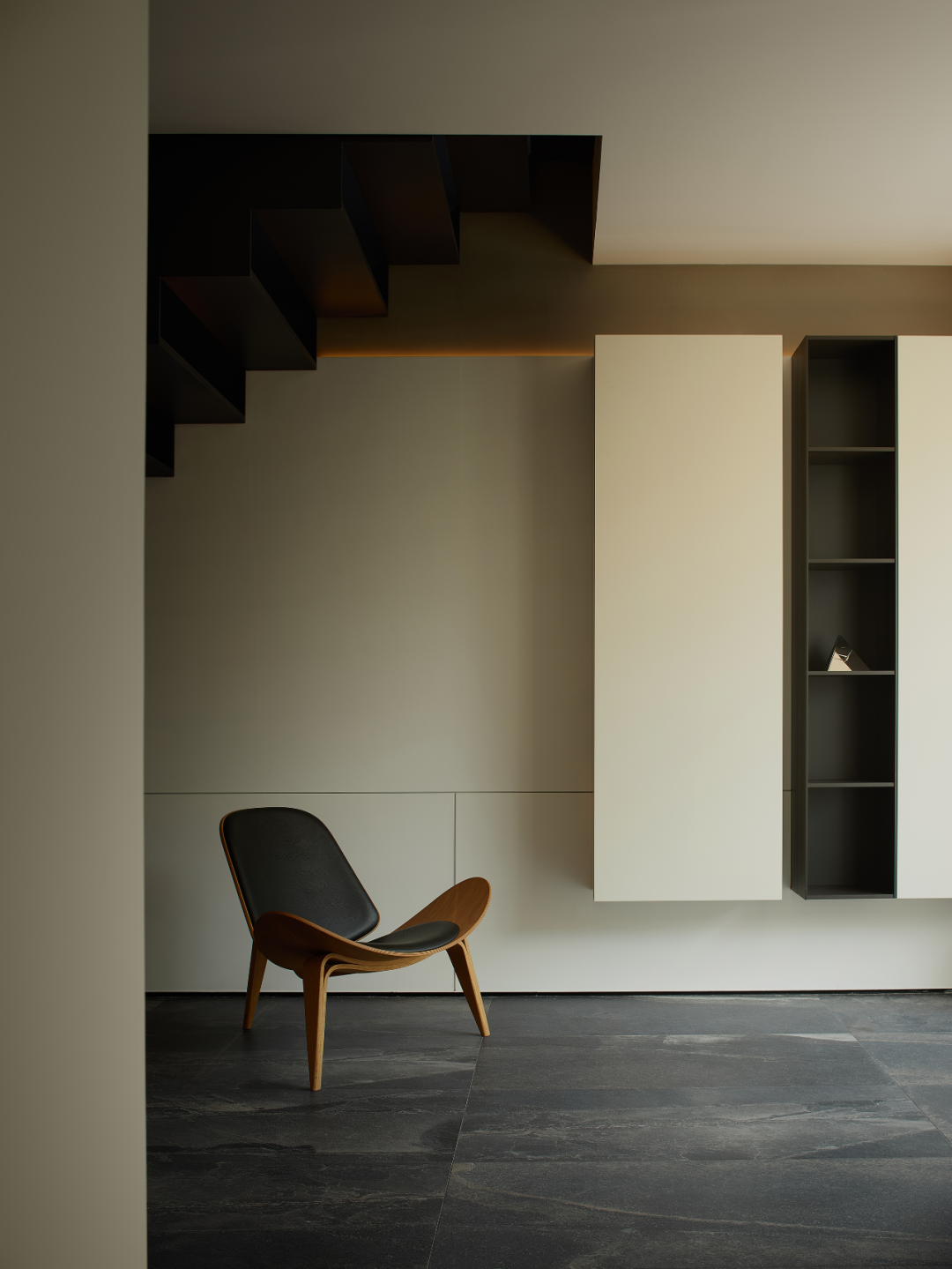
作为入口处的序章,一面2.16x1.4m的悬墙伸展而出,其单面支撑的力学结构,使常规连接天地的墙体具备了视觉的轻盈感。空间中与之呼应的独立壁橱、去往二楼的悬吊楼梯,以相同的方式构成平面上不曾直观显现但却暗藏的“直角轨迹”,体现工艺的巧妙,也展示泰美工意美学馆的审美追求和匠心营造的品质精神。
As a prelude to the entrance, a 2.16x1.4m suspended wall extends out, its single-sided support mechanics giving a visual lightness to the wall that conventionally connects heaven and earth. The independent closet and the suspended staircase to the second floor in the space echo the same way, forming a "right-angle trajectory" that is not visually visible on the plane but hidden, reflecting the ingenuity of craftsmanship and demonstrating the aesthetic pursuit and quality spirit of Tamiami Gongyi Aesthetic Museum.


垂直空间的楼梯是路径的重要构成部分,除了真实的功用之外,其纤薄、透空、悬浮的物理形态成为了空间的主要亮点。一直以来,具备关键作用的结构莫不隐藏于事物的表象之下,经过精心设计、修饰的面层占据着日常的主流审美,一旦转变成结构应该为结构服务,那么“结构即装饰”的理念则变的渐渐清晰起来。
The staircase in the vertical space is an important part of the path. In addition to its real function, its slim, transparent and suspended physical form has become the main highlight of the space. All along, the key role of structure is always hidden under the surface of things, and the carefully designed and decorated surface occupies the mainstream aesthetic of daily life.


捕光的容器
Light-Catching Containers
━
物质性的建筑如何才能具备活泼的生命力,在勒·柯布西耶看来,自然是光,所以他说,“建筑是那些组合起来的几何体在光线下精妙、恰当和出色的表达。”光的存在,使事物有着戏剧性的感知张力,也展示了其创造空间和时间的能力。光穿越于空间,引导我们从静态走向动态,从理性走向精神,从有限局部走向无限联想。
How can material architecture have a lively life? For Le Corbusier, it is naturally light, which is why he said, "Architecture is the subtle, appropriate and brilliant expression of those assembled geometries in the light." The presence of light gives things a dramatic perceptual tension and demonstrates its ability to create space and time. Light traverses through space, leading us from static to dynamic, from rational to spiritual, from limited local to infinite association.


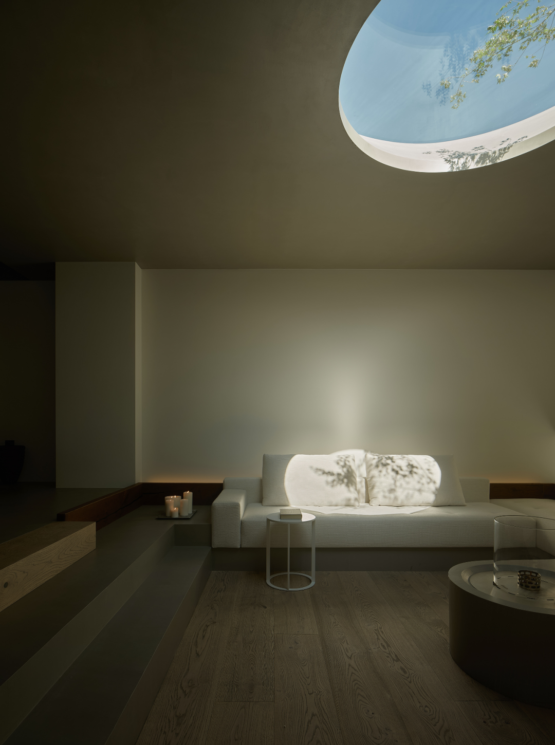
对于建筑而言,门洞与窗洞通常是形体的破坏者,它们必须转变为形体的表现者,才有了积极的审美意义。直径1.4m的顶部开孔,外扩为直径1.8m,倾斜的口部设计,在视觉上起到减薄楼板厚度的作用,同时增大外部光亮的进入,形成上升的自然引力。光随着时间的推移和天气的阴晴变化,显现出丰富的面貌。
For architecture, doorways and window openings are usually destroyers of form; they must be transformed into exponents of form before they have positive aesthetic meaning. The 1.4m diameter top opening, flared out to a diameter of 1.8m, with an inclined mouth design, serves to visually thin the thickness of the floor slab, while increasing the entry of external light and creating a rising natural gravitational force. The light reveals a rich appearance with the passage of time and the change of weather's cloudiness.


下沉式的待客区为轴线布置,中心的壁炉对应着天窗,圆和圆,大小虽不一,功能也各异,在方正的空间之中,却一致成为能量的聚集地,人因功能的特殊定位而围坐,光因设计的恰如其分的干预而凝聚。四周围以高出台面5公分的矮短实木,组成沙发区的定制靠背。底部的拾级而下与顶部的逐渐外扩,凭借两种共存的不同方式延展空间的能量、视觉感受和感知维度。
The sunken hospitality area is arranged on an axis, with a fireplace in the center corresponding to the skylight. The circle and round, though of different sizes and functions, are unanimously a gathering place of energy in the midst of a square space, where people sit around due to the special positioning of functions and light coalesces due to the appropriate intervention of the design. The sofa area is surrounded by a short solid wood 5cm above the counter top, forming a custom backrest. The bottom step down and the top gradual expansion extend the energy, visual feeling and perceptual dimension of the space with two different ways of coexistence.

自然的本质
The Essence Of Nature
━
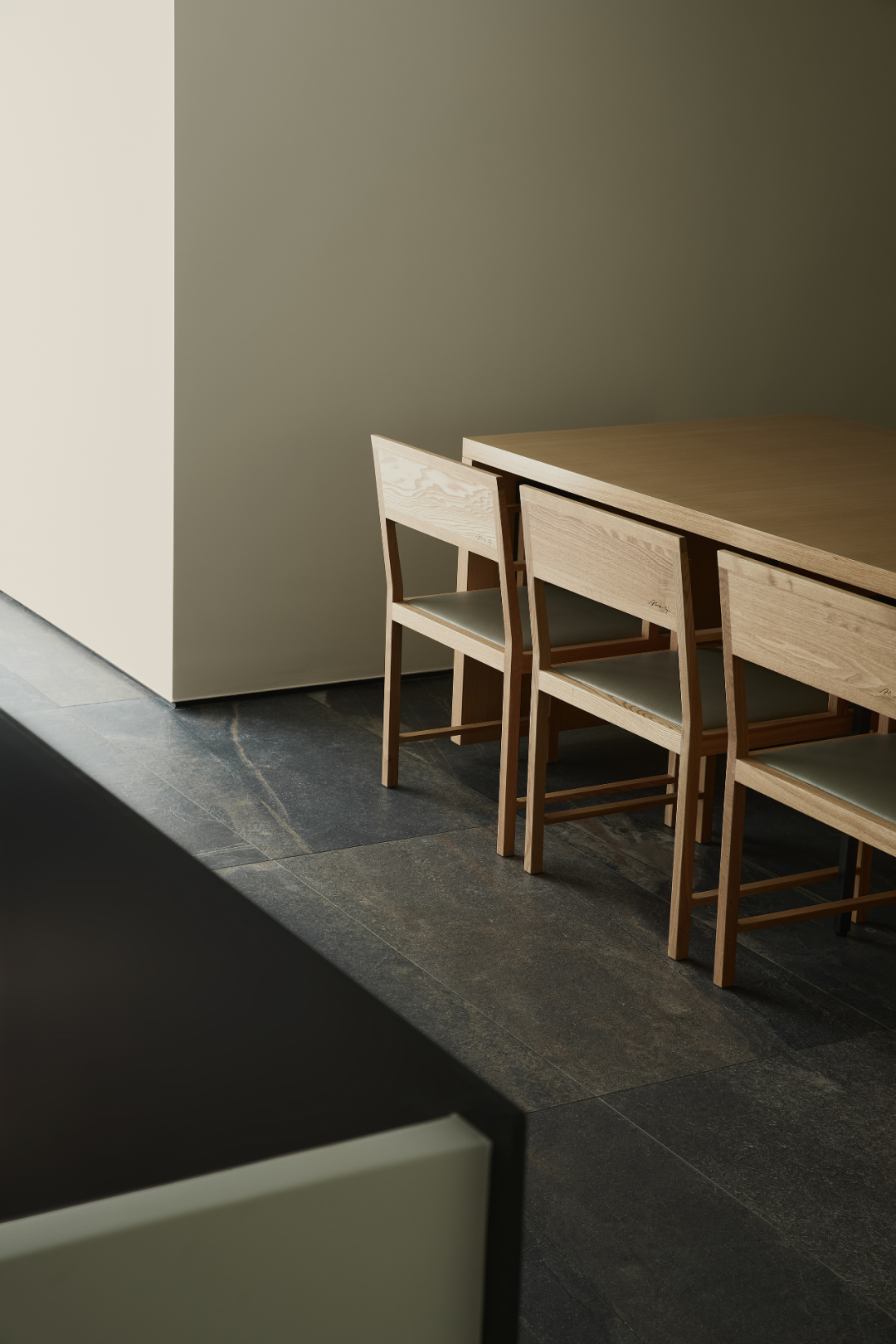
二楼是独立的招待区域,原木的桌椅铺陈于一片深色的“帷幕”之中,等客就座,等剧开演。为了照顾开放区立面的完整性,厨房改为阳台处开门;另一侧公卫虽小,也男女分开,除了仪式感的本身,也是一种细腻的尊重。裸露的天花结构在不对称的线性灯和固定于梁侧壁的灯体晕染下,非匀质的空间构造表现着匀质的特性。
On the second floor is a separate hospitality area, where the original wooden tables and chairs are laid out in a dark "curtain", waiting for the guests to be seated and for the play to start. In order to take care of the integrity of the open area façade, the kitchen has been changed to open at the balcony; on the other side, although the public bathroom is small, it is also separate for men and women, in addition to the sense of ceremony itself, it is also a delicate respect. The exposed ceiling structure is haloed by asymmetrical linear lights and lights fixed on the side walls of the beams, and the non-homogeneous spatial structure expresses the homogeneous character.







 ▲Plan @ 1F
 ▲Plan @ 2F
 ▲Plan @ 东立面
 ▲Plan @ 西立面




暂无评论内容