
自然中的一切物质,不论有形的山川河流,抑或是我们自身的存在,无不由光所构建。视觉上的明暗关系往往仅是单一的身体感知,随着时间的推移、周围环境与场地的变化,使光具有更多层次的语境表达,虽然隐而不见,但却勾勒出了物体的精确轮廓,并于几何线条的纵横交错间,蕴藏着某种无限的精神力量。
All substances in nature,from tangible mountains and rivers to our own existence, are shaped by light. The visual contrast of light and shadow only represents a singular physical perception. However, as time changes and the surrounding environment and site evolves, light gains multifaceted contextual expressions. Although it is invisible, light delineates the clear contours of objects, and also harbors a certain boundless spiritual power within the crisscrossing of geometric lines.
峡谷
光的序幕
━
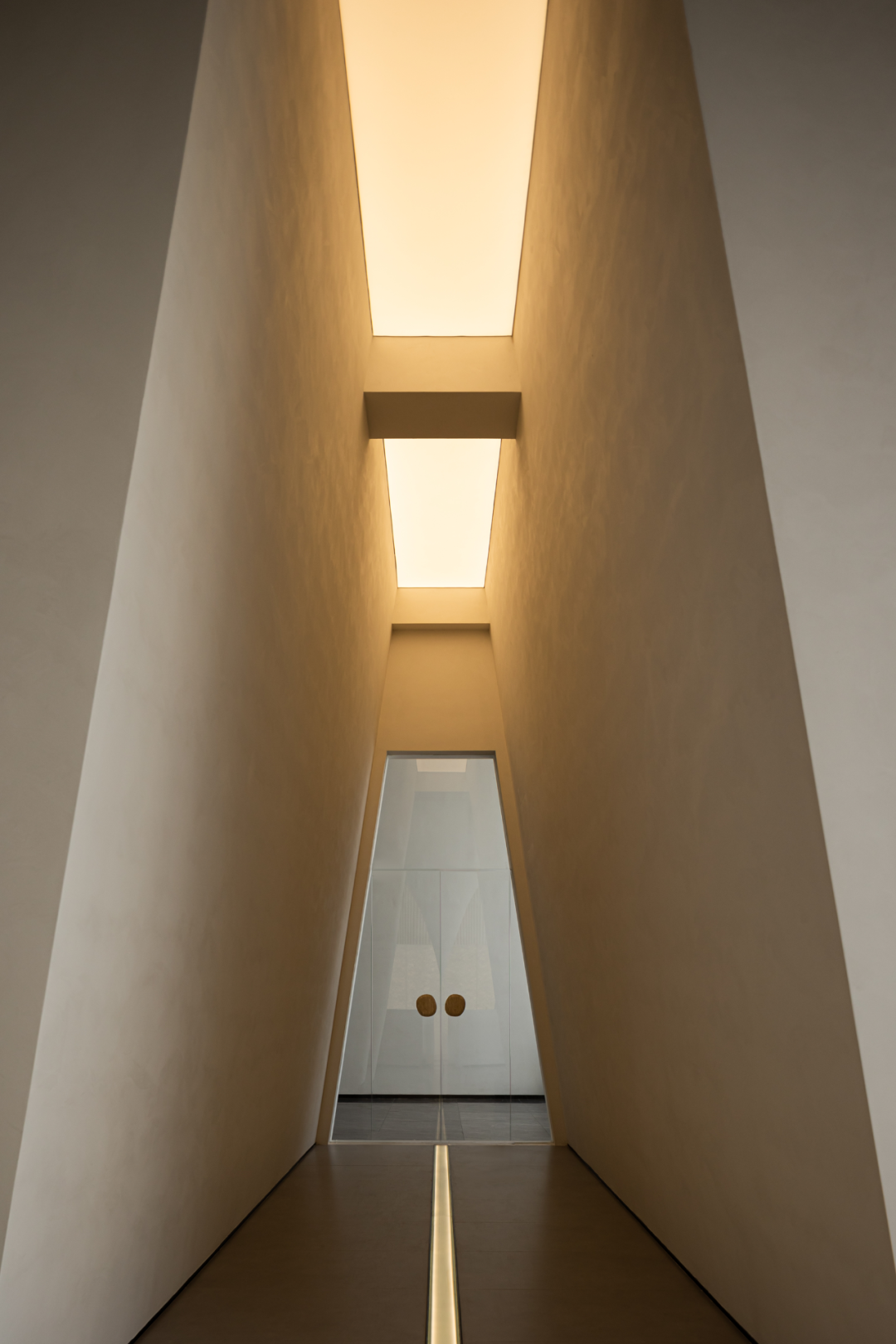
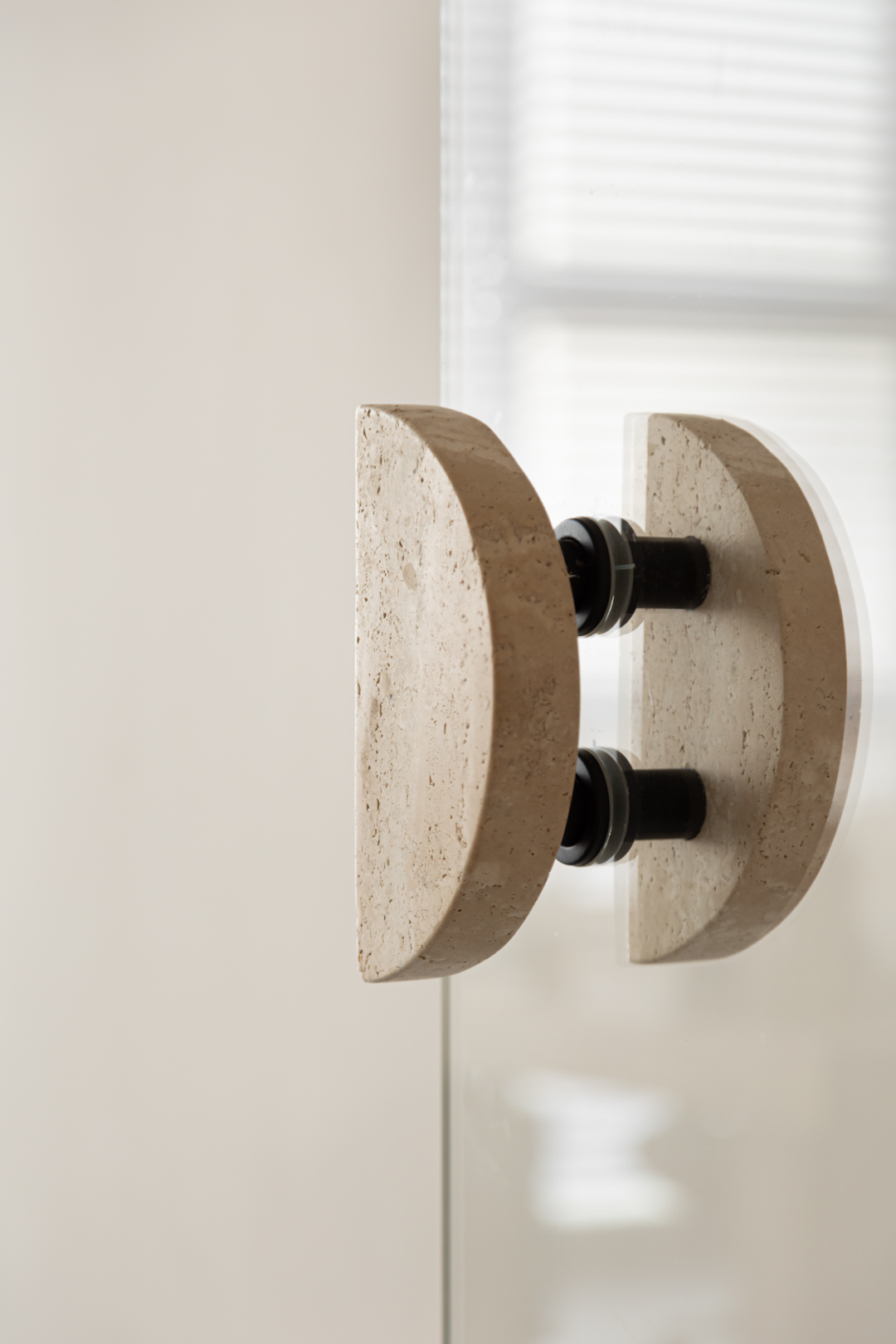
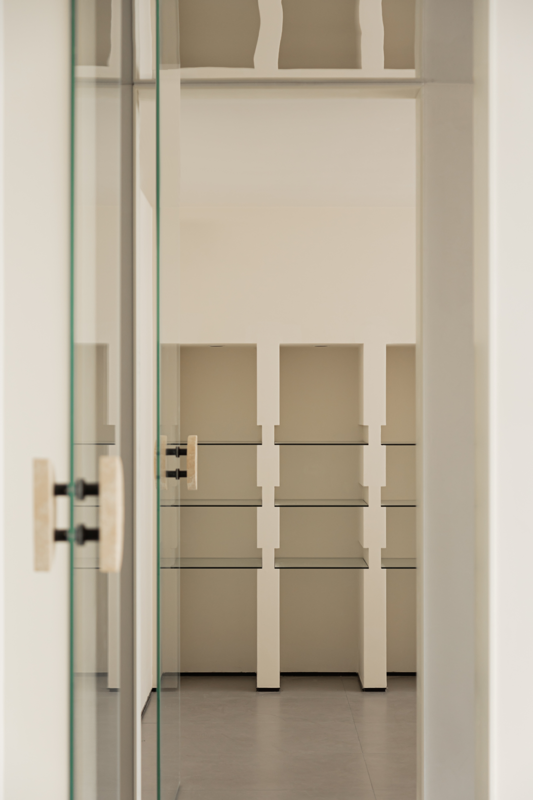
建构,向来始于对具体功能的探究,进而生发出场地的精神,二者交织形成立体的、可体验的空间。推门而入,通透玻璃门与自然洞石把手的结合,点出虚与实、厚重与轻盈、自然与当代的主题要旨,同时经由室外公共区转入室内,情绪逐渐趋于舒缓、平静。通过整面玻璃的间隔,独立出内外之别,又将彼此连接起来。
Tectonic, always begins with the exploration of specific functions, then giving rise to the spirit of site. These elements interweave to shape a three-dimensional, experiential space. Upon entering, the combination of transparent glass door and natural travertine-made handle highlights the theme of virtual and real, heavy and light, natural and contemporary. Transitioning from the outdoor public area to indoors, the ambiance gradually evolves into a soothing and tranquil state. The entire surface of the glass separates inside and outside area, but also visually connects them together.
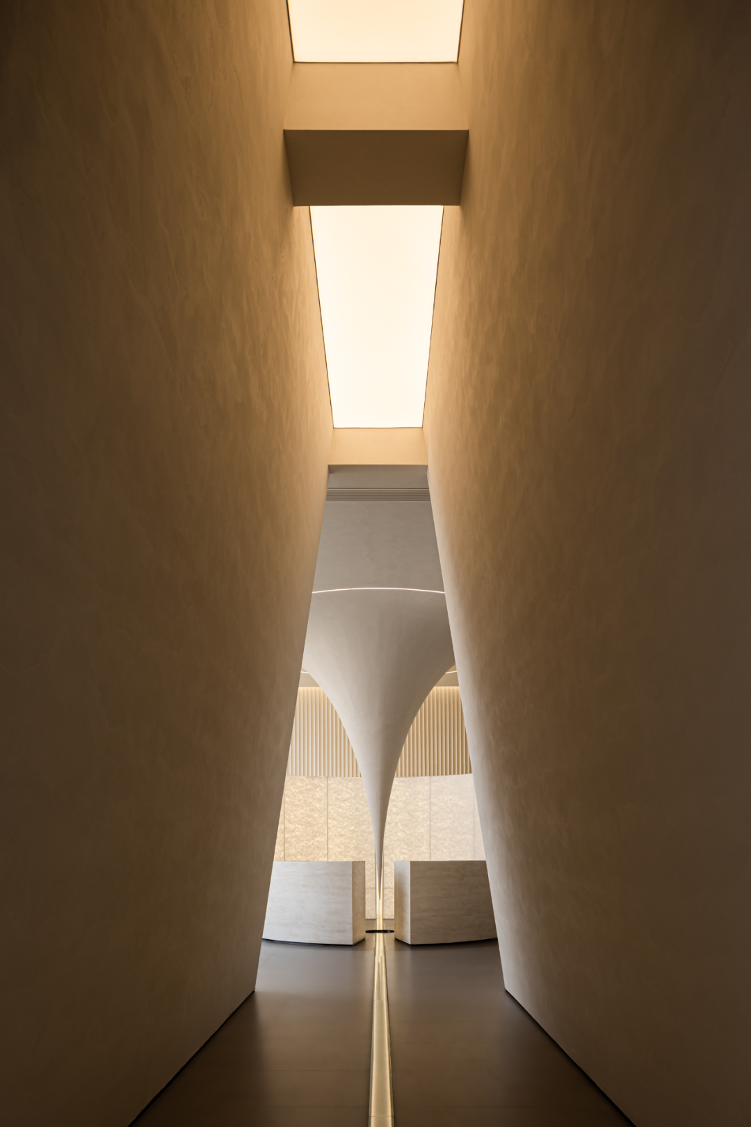

入口两侧墙体由下向上倾斜、合拢,借助层高的优势塑造了静谧而深远的峡谷意象,顶部模拟“一线天光”,令立面变得柔和有度。“复行数十步”之后,随即“豁然开朗”,空间节奏的起伏呈现多维度的场景体验。并以内嵌于地面的光带为空间轴线,建立对称的视觉审美,引导访客顺其前行,进而开启光的序幕。
The walls on both sides of the entrance slope from bottom to up and close, creating a quiet and far-reaching canyon image with the advantage of height. The top simulates "a line of sky light", making the facade gentle and mellow. After "walking dozens of steps", then "suddenly enlightened", the fluctuation of space rhythm presents a multi-dimensional scene experience. And the light belt embedded in the ground is the spatial axis, establishing a symmetrical visual aesthetic, guiding visitors to follow it, and then opening the prelude of light.



能量
引力之场
━
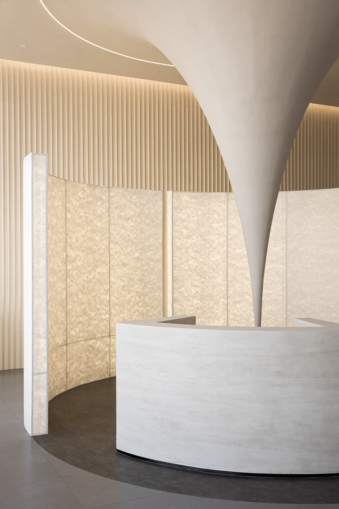
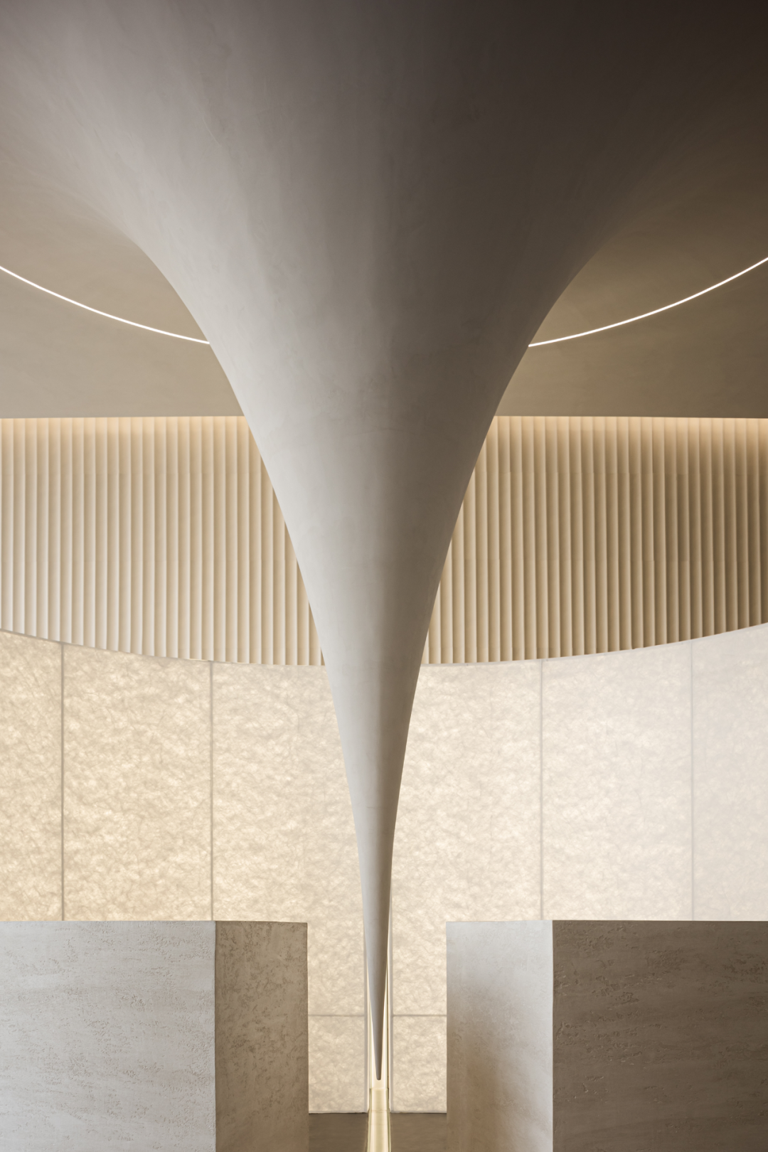
作为自然现象之一,引力可以改变时空形态,令物体朝着源点接近。于前厅中央,天花有如被吸着、牵引、拉伸,借由空间隐喻品牌的自身引力,让抽象的语言通过具象的形式呈现出来。仿洞石肌理的接待台间隔出一定距离分置左右,使引力装置能够完整的展现于眼前,与身后的“屏风”围合成空间能量的中心。
As a natural phenomenon, gravity has the power to alter the state of space and time, guiding objects closer to its source. In the center of the reception hall, the celling appears to be drawn, pulled and stretched by the force of gravity, a metaphor of the brand’s attractiveness through space, then the abstract concepts are manifested in tangible forms. The reception desk, adorned with imitation travertine texture, is placed at a calculated distance on both sides, allowing the gravitational device to be fully displayed before the eyes. Together with the “screen” behind, forming a focal point of spatial energy.


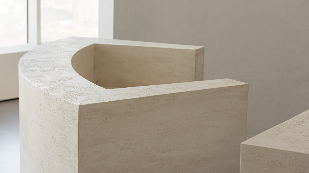
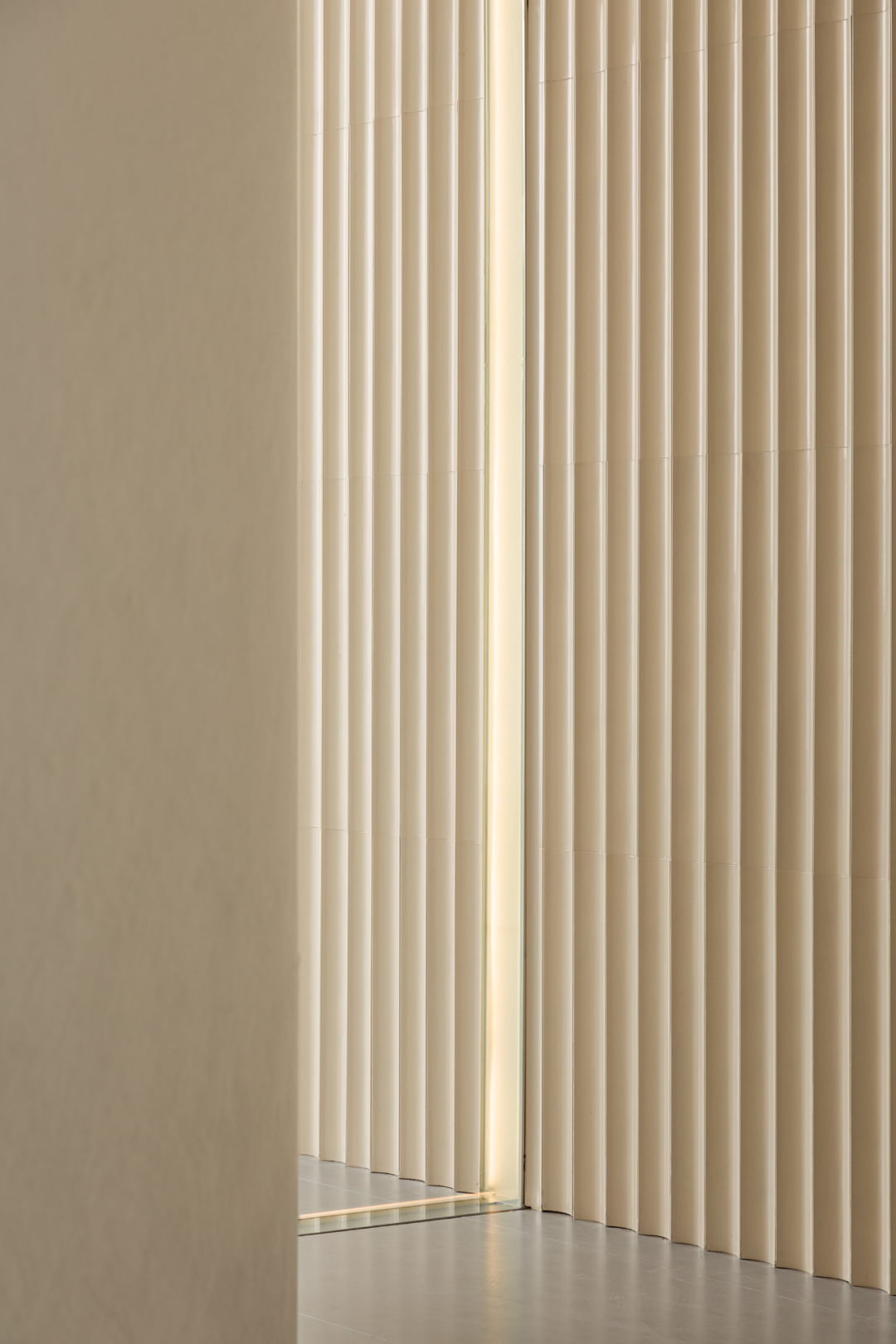
以行进路径为参考依据,视线由近及远,从接待台到半高“墙体”再到阵列的波浪式立面背景,有机的形体于高低之间依次递进,产生了多结构层次的、清晰而分明的视觉感受。圆弧“屏风”以杜邦纸为表现对象,内置暖灯源,光晕染而出,细腻的肌理如丝质般铺陈开来,赋予空间温润的独特人文质感。
The visual journey follows the walking path, transitioning from the proximity reception desk to the mid-height “wall”, extending further to the undulating facade in the background. These organic forms progress between elevations, creating a vivid and distinct visual experience with diverse structural layers. The arc-shaped “screen” , crafted from DuPont paper and embedded with warm lighting, emanates a subtle glow, while its delicate texture resembles silk, fostering a distinctive humanistic ambiance within the space.



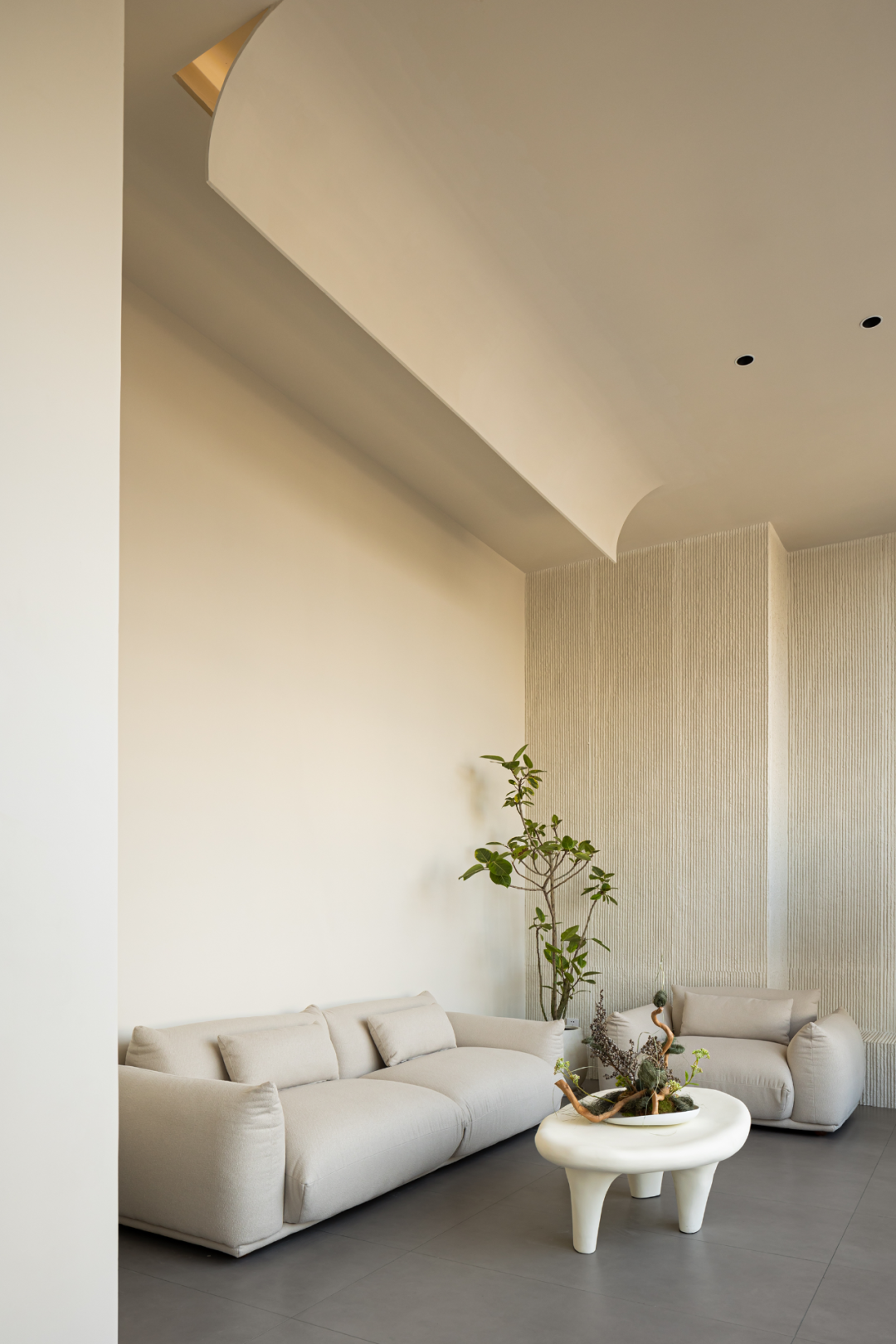
结合柱体落位,南北向墙体进行修齐、平整处理,深度足够的地方设置西式橱柜,将一应设备收纳其中,作为功能的补充,满足日常的使用需要。西南角分置休息区,便于等待、交谈和小憩,其背后墙体呼应弧形的设计语言,将硬朗的阳角一一柔化,同时与极具个性的低矮家具组合相得益彰。
Considering the position of structural columns, the walls in north and south directions are smoothed and leveled. Western style cabinets are installed in area with sufficient depth to store various equipment, serving as a functional complement to meet daily needs. The southwest corner is designated as a resting area for waiting, communication and relaxation. The back wall echoes the arc-shaped design concept, softening the sharp angles while complementing the distinctive combination of low-rise furniture harmoniously.


转换
起伏情绪
━
平面是由不同空间体块组成的社群,相互之间可以交流。三面采光的场地环境,确定了功能的安排,北侧最优的城市景观面布局为主要接待区,其次则顺由入口轴线,再置入一条相互垂直的轴线,构建为内部通道,连接各个功能空间。对称的玻璃弧墙除了界定空间、增加采光、创造节奏,也与实墙形成虚实的对比。
The layout is a community composed of different spatial blocks that can communicate with each other. The three-sided daylighting environment dictates the arrangement of functional area. The optimal urban landscape on the north side serves as the main reception area. Then a secondary axis is introduced perpendicular to the entrance axis, forms an internal passage, connecting functional spaces. Symmetrical curved glass walls not only define space, enhance daylighting, create rhythm, but also establish a contrast between virtual and real with the solid walls.


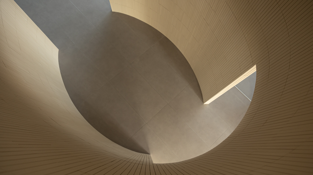

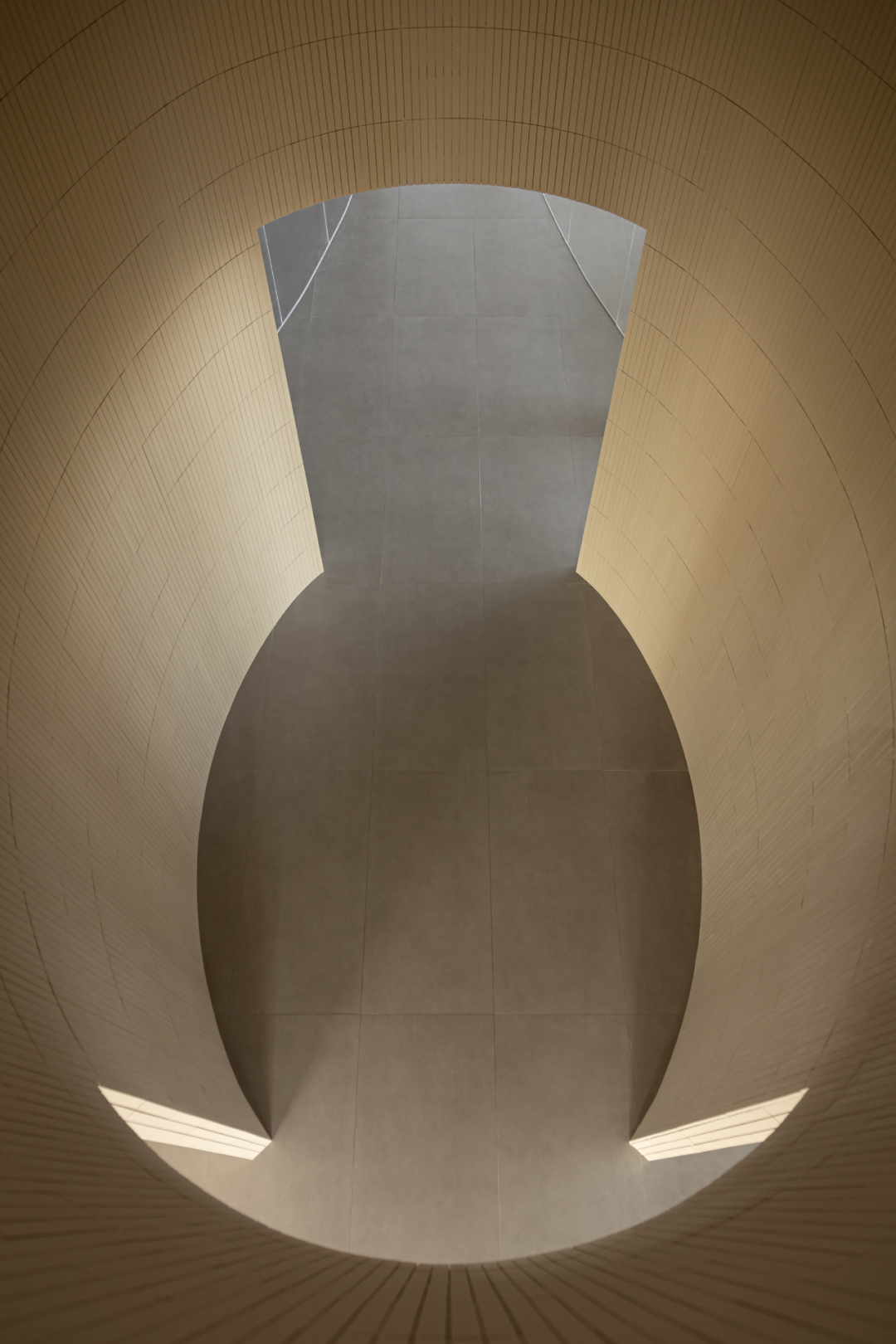

及至后场,空间进行合理的上下分层,给内部办公区拓展出了更多的可使用面积。为解决实际层高的转变,于通道之处置入一个赋以单独的材料的圆柱体,形成“通道之中的通道”的概念,并确保朝向公区立面形态的完整性。顶部预留出横向开口,有利于内部空气、视线的流动以及二楼与楼下的联系、互动。
Walking to the back area, the spatial layout features a sensible arrangement with upper and lower tiers, expanding usable area for internal office spaces. In order to solve the variation in actual floor height, a cylinder is integrated within the channel, creating the concept of “ channel within the channel” while maintaining the facade’s integrity toward the public area. A top opening is reserved, fostering connectivity and interaction between the second floor and the downstairs.


映射
高光时刻
━
基于主次关系的设计策略,由视觉张力主导的形式语言转向平静、舒适的空间表达,辅助空间同样兼具功能需求和审美趣味。与立面基调色一致白色百叶帘有着调节光量的作用,开合之间,使天然材质的自然性、布艺的亲肤感和几处点缀的绿意互为协调,营造出空间的另一种调性——素雅、简练、令人心生平静。
Based on the hierarchical design strategy, the visual tension-led formal language transitions to a serene and comfortable spatial expression. The auxiliary spaces integrate both functional needs and aesthetic interests. The white blinds aligned with the facade's color can regulate light. Between the opening and closing, fostering a harmonious coordination between the natural materials, the tactile comfort of fabrics, and several green plants. This creates another tone for the space – simple, elegant, and evoking a sense of tranquility.








暂无评论内容